Classroom design is usually treated as something fixed. Most schools inherit layouts, adjust them slightly, and rarely question whether the space is actually working for how students and teachers interact.
But once you start looking closely at movement, visibility, and attention patterns, it becomes obvious that classroom layout has a direct impact on learning behavior.
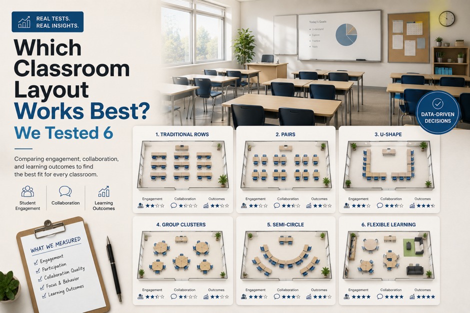
To explore this, we tested six different classroom configurations using Floor Plan Maker, focusing less on aesthetics and more on how each layout affects real classroom dynamics like movement flow, teacher visibility, group interaction, and disruption control.
The results were more varied than expected.
Why We Tested Instead of Choosing One “Standard Layout”
The most common classroom layout is the traditional row format:
- desks aligned facing forward
- teacher at the front
- clear central aisle
It’s simple, familiar, and efficient to set up.
But the problem is that “standard” does not necessarily mean “optimal.”
We wanted to answer a more practical question:
What actually changes when we rearrange the same classroom in different ways?
Using Floor Plan Maker, we generated multiple layouts quickly and treated each one as a behavioral experiment rather than a design exercise.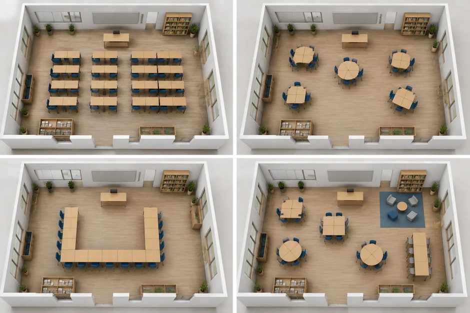
4 classroom layouts
Layout 1: Traditional Rows (Control Setup)
This is the default structure in most classrooms.
Key characteristics:
- all desks face the teacher
- clear front-of-class focus
- strong structure and discipline
Observations:
- excellent for lectures
- limited peer interaction
- predictable attention direction
This layout works well when information is one-directional. However, it restricts collaborative learning and can reduce engagement over time.
It served as our baseline for comparison.
Layout 2: U-Shaped Arrangement (High Visibility Model)
This version, generated and adjusted in Floor Plan Maker, placed desks in a U-shape facing inward.
Strengths:
- improved teacher visibility of all students
- stronger sense of inclusion
- easier group discussion setup
Weaknesses:
- reduced total seating capacity
- less efficient use of space
- potential distraction from side interactions
This layout immediately changed classroom dynamics. Instead of students facing only forward, attention became distributed.
It felt more conversational than instructional.
Layout 3: Cluster Groups (Collaboration Focused)
This layout grouped desks into small clusters of 4–6 students.
The idea was to encourage peer-to-peer interaction.
Observations:
- strong group collaboration
- natural discussion flow
- increased noise levels
While engagement improved, control became more challenging.
Teachers lose some visual dominance in this structure, and transitions between individual and group attention are less structured.
Still, for project-based learning, this layout was highly effective.
Layout 4: Circular Layout (Equal Participation Model)
This version arranged desks in a full circle.
Generated in Floor Plan Maker, it immediately felt different from traditional classrooms.
Strengths:
- maximum equality of visual focus
- strong group discussion environment
- no “back row” disadvantage
Weaknesses:
- inefficient space usage
- difficult for note-taking/lecture-style teaching
- limited scalability for large classes
This layout worked surprisingly well for discussions but poorly for structured instruction.
It changes the role of the teacher from “leader” to “facilitator.”
Layout 5: Zonal Classroom (Hybrid Structure)
This layout divided the classroom into functional zones:
- lecture zone
- group work zone
- quiet study zone
Using Floor Plan Maker, we experimented with separating these areas spatially.
Observations:
- supports mixed teaching styles
- allows activity switching without rearrangement
- improves flexibility
However:
- requires clear behavioral rules
- can feel fragmented if not managed properly
This was one of the most balanced layouts in terms of flexibility, but it depends heavily on classroom discipline and transitions.
Layout 6: Asymmetric Flow Layout (Experimental Model)
The final layout broke symmetry entirely.
Instead of uniform rows or clusters, desks were arranged based on movement patterns:
- wider pathways near entrances
- angled seating near focal points
- irregular grouping based on visibility
This was the least “standard” layout generated in Floor Plan Maker, but it produced interesting behavior patterns.
Observations:
- natural movement flow improved
- reduced congestion points
- more dynamic attention distribution
However, it requires adjustment time for both teachers and students.
It is not immediately intuitive, but it adapts well once used consistently.
Comparing All Six Layouts
After reviewing all six configurations side by side, a clear conclusion emerged:
There is no single “best” classroom layout.
Each structure optimizes a different learning priority:
- Rows → structure and discipline
- U-shape → visibility and discussion
- Clusters → collaboration
- Circle → equality of participation
- Zones → flexibility
- Asymmetric → adaptive movement
The choice depends entirely on teaching style.
What Floor Plan Maker Revealed About Classroom Design
Using Floor Plan Maker was not about generating perfect layouts.
It was about exposing trade-offs that are usually invisible in static classroom setups.
Instead of asking:
- “What is the correct layout?”
We started asking:
- “What behavior does this layout encourage?”
That shift changed how we evaluated each configuration.
The tool made it easier to compare possibilities quickly, but the real insight came from observing how each layout influenced interaction patterns differently.
Final Thought
Classroom design is often treated as a fixed constraint, but it is actually a flexible system of behavioral choices.
The six layouts we tested did not produce a single winner.
Instead, they showed that effective classroom design depends on what you want the space to do—not just how you want it to look.
And once you start thinking in terms of behavior instead of furniture placement, tools like Floor Plan Maker become less about drawing spaces and more about understanding them.