
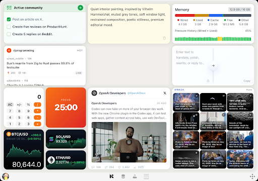
Many Mac users begin the day in the same way: open a browser, restore yesterday’s tabs, visit several familiar pages, and scan each one for a small piece of new information. It might be a service status update, an RSS headline, a GitHub release, a Product Hunt launch, a Reddit thread, or a dashboard number. None of these checks is difficult, but repeating them throughout the day creates a surprising amount of friction.
The problem is not simply “too many tabs.” It is the gap between the information a person needs and the steps required to reach it. A useful desktop widget closes that gap. Instead of navigating through a full website every time, the widget brings a focused view of the relevant information within quick reach. For sources that do not provide native macOS widgets, tools for creating Mac desktop widgets from web pages and feeds can make a daily workflow far more direct.
Why Repeated Web Checks Become Expensive
A single browser check may take less than a minute. The hidden cost appears when the process is repeated across many sources and many sessions. Each check requires a context switch: leave the current task, locate the right tab or bookmark, wait for the page, dismiss visual noise, find the relevant section, and then return to work.
That sequence affects concentration even when the answer is “nothing changed.” A developer monitoring a release page, for example, does not need the entire repository interface. A support lead checking a status page does not need the site navigation, marketing copy, and historical incident archive. A researcher following a discussion thread may only need the newest replies. The full page contains far more information than the moment requires.
A focused widget changes the interaction from browsing to checking. This is a small distinction with a practical effect: the user asks one question, sees one answer, and continues working.
Native Widgets and Custom Widgets Serve Different Needs
Apple’s widget system is a good fit when an application already offers a well-designed native widget. Calendar, weather, reminders, and other common categories often work best through native integrations. They are polished, power-efficient, and closely connected to the operating system.
The limitation is coverage. Many important information sources are websites, feeds, project pages, or small internal tools rather than Mac applications. Even when a service has a desktop app, its widget may not expose the exact view a user needs.
Custom widgets fill this gap. They do not need to replace native widgets. Instead, they extend the idea of glanceable information to the long tail of web sources: a niche blog feed, a project’s release notes, a public metric, a community page, or a lightweight tool that has no reason to build a full macOS application.
Start With One Question, Not an Entire Website
The best custom widgets are designed around a narrow question. “What is new on this website?” is more useful than “show me the website.” “Has the service status changed?” is better than shrinking an entire status portal into a small frame.
Before creating a widget, write down the question it should answer. Good examples include:
- What are the three newest posts in this RSS feed?
- Has this project published a new GitHub release?
- What is the latest update on this service status page?
- Which products are currently leading a launch list?
- Are there new replies in a discussion I am following?
- What does this small web calculator return for my regular input?
This question-first approach prevents a common mistake: trying to reproduce the whole browser inside a widget. A widget should remove steps, not compress every possible action into a smaller area.
Choose Sources That Change at a Useful Pace
Not every page benefits from becoming a widget. The strongest candidates have information that changes often enough to justify checking but not so unpredictably that constant alerts are necessary.
RSS and Atom feeds are especially suitable because their structure already separates titles, dates, links, and summaries. Release pages and status pages also work well because users usually care about the latest state. Public launch lists, community threads, and frequently updated reference pages can be useful when the widget highlights only the newest or most relevant items.
Static pages are usually poor candidates unless the widget adds a useful interaction. A page that changes once a year will not save much time as a live view. Likewise, a complex application that requires multiple authentication steps may be better served by its native app or a bookmarked browser tab.
Keep the Interface Glanceable
A desktop widget earns its place by being readable in seconds. Clear hierarchy matters more than visual decoration. The newest item, current status, or primary result should be obvious. Supporting details can appear below it, but they should not compete for attention.
Useful design choices include short titles, visible timestamps, consistent spacing, and a clear action for opening the original source when deeper reading is necessary. A list should show only enough items to answer the immediate question. A status view should make normal and abnormal states easy to distinguish without depending on color alone.
Refresh behavior also matters. Updating too often wastes resources and may create unnecessary requests to the source. Updating too slowly defeats the purpose. The right interval depends on the information: service health may need frequent updates, while a weekly blog feed does not.
Use AI for Speed and Skills for Control
Modern widget tools can take two complementary approaches. An AI-assisted workflow helps a non-developer describe the desired result in ordinary language and quickly generate a first version. This is useful for exploration, especially when the user knows what information is needed but does not want to begin with code.
A developer-oriented workflow offers more control. A locally built Skill or plugin can define the source, transformation logic, layout, refresh behavior, and interactions explicitly. This approach is preferable when the widget needs careful error handling, authenticated data, reusable logic, or long-term maintenance.
The choice is not ideological. AI is valuable for reducing the cost of the first draft; code is valuable for precision and repeatability. A practical workflow may use AI to establish the shape of the widget and then refine important behavior through a development toolchain.
A Practical Setup Process
First, observe your routine for a day and note every website you reopen primarily to inspect a small update. Do not create widgets immediately. The goal is to identify repeated behavior rather than collect attractive dashboards.
Second, rank the candidates by frequency and effort. A source checked ten times a day is a stronger candidate than one checked twice a month. Give extra weight to pages where finding the relevant information requires scrolling or navigating.
Third, define the widget’s one question and the minimum data needed to answer it. If the widget needs a title, timestamp, status, and source link, do not also import comments, navigation menus, advertisements, and unrelated metadata.
Fourth, build one widget and use it for several days. Pay attention to whether it actually reduces browser visits. If you still open the full page every time, the widget may be missing an important detail or presenting the information poorly.
Finally, add more widgets slowly. A panel filled with dozens of competing cards recreates the same attention problem as a browser filled with tabs. A small set of reliable, purpose-built views is usually more valuable.
Privacy, Authentication, and Reliability
Any tool that reads web content should be evaluated carefully. Public feeds and public pages are straightforward, but private dashboards may contain account or business information. Users should understand where credentials are stored, whether page content leaves the device, and what permissions a generated widget receives.
For sensitive sources, prefer narrowly scoped access and local execution where possible. Do not place passwords or long-lived access tokens directly in widget code. If a source offers an official API, use its recommended authentication method and request only the permissions required.
Widgets also need honest failure states. A blank area should not silently imply that nothing has changed when the real cause is a network error or a changed page structure. Showing a last-updated time and a clear refresh failure helps the user distinguish stale information from a genuine result.
Measure the Result by Fewer Interruptions
The value of a custom widget is not the number of data sources it can display. The real measure is whether it removes unnecessary steps. After a week, ask: Did I open fewer tabs? Did I spend less time locating routine information? Could I check an update and return to work without losing my place?
If the answer is yes, the widget is doing its job. If not, simplify it or remove it. The goal is not to create a more impressive desktop. It is to build a calmer interface between attention and the small pieces of web information that matter throughout the day.
Conclusion
Browser tabs are excellent for exploration, research, and full interactions. They are less efficient for repeated checks of narrow information. Custom Mac desktop widgets offer a useful middle layer: more focused than a website, more flexible than the limited set of native widgets, and quicker to reach than a recurring browsing routine.
Start with one repeated check, define one clear question, and create the smallest view that answers it. That modest change can turn a distracting habit into a fast, intentional workflow.