In 2026, almost every business uses many apps. One app may track sales. Another may track payments. Another may show customer data. Another may help with projects, tasks, or team work. This can make daily work feel messy if all the information is spread across many places.
That is where a core app dashboard becomes very useful. It brings the most important data into one clean screen. Instead of opening ten tools to understand what is happening, users can see key numbers, charts, alerts, and updates in one place.
Think of it like the control panel of a car. You do not need to open the engine to know your speed, fuel level, or warning signs. The dashboard shows the main things quickly. A core app dashboard works in the same way for apps, businesses, teams, and systems.
In this article, we will talk about what a core app dashboard is, why it matters in 2026, how it works, what parts it includes, and which visuals make data easier to understand. We will also look at its biggest benefits and the modern features that make dashboards smarter today.
What Is a Core App Dashboard?
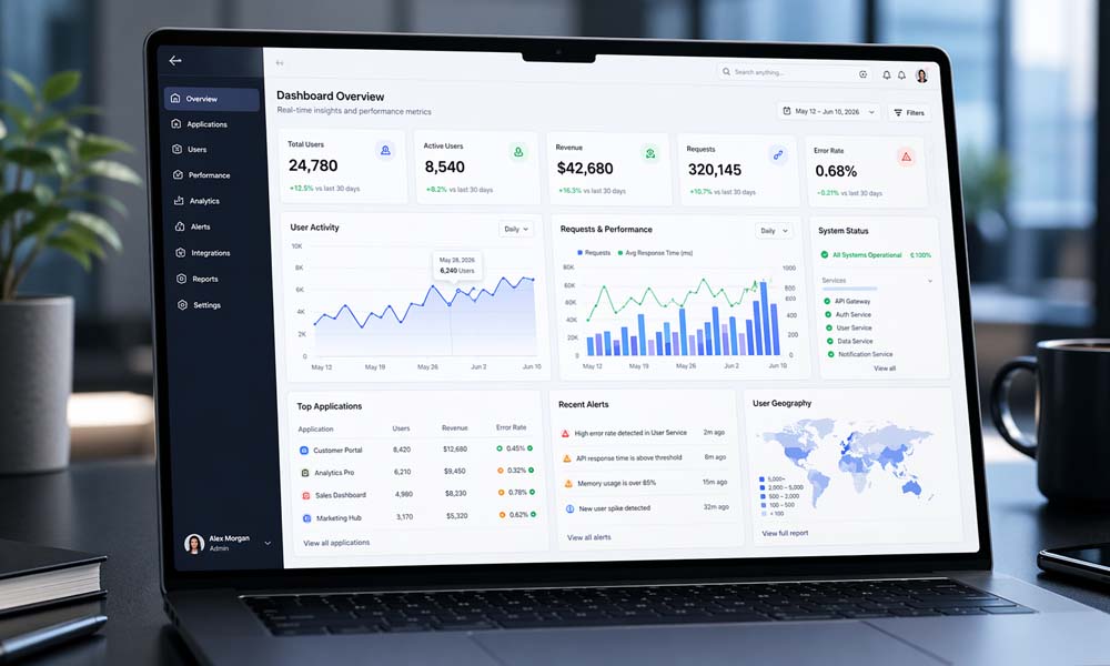
A core app dashboard is a central screen that shows important information from different apps, tools, or systems. It helps users see useful data without searching through many pages. It can show numbers, charts, tables, alerts, reports, and tasks in a simple way.
For example, a business owner may want to see daily sales, unpaid invoices, website traffic, team tasks, and customer feedback. Without a dashboard, they may need to open many apps. But with a core app dashboard, all of this can appear in one clear place.
The main goal is simple. A dashboard turns raw data into clear information. Raw data can be hard to read. It may look like long lists, numbers, files, or reports. But dashboard visuals make it easier. A chart can show growth. A tile can show revenue. An alert can show a problem.
A core app dashboard is not just a pretty screen. It is a smart work space. It helps people understand what is going on and what they should do next. This is why dashboards are now important in business apps, IoT systems, smart home tools, project tools, and IT platforms.
Why a Core App Dashboard Matters in 2026
In 2026, people want fast answers. They do not want to wait for long reports or search through confusing data. Teams need to know what is working, what is slow, and what needs quick action. A core app dashboard helps by showing the right information at the right time.
Businesses also use more digital tools than ever before. Sales teams use sales apps. Finance teams use payment tools. Project teams use task systems. Marketing teams use campaign tools. IT teams use monitoring tools. When all these tools create data, it becomes hard to manage everything without one clean view.
A core app dashboard solves this problem by acting like a single source of truth. This means everyone can look at the same place and understand the same facts. This reduces confusion. It also helps teams make better choices because they are not guessing.
Real-time updates are another big reason dashboards matter in 2026. If a website goes down, an app slows down, or sales drop suddenly, users need to know fast. A strong dashboard can show alerts quickly, so teams can act before the problem grows.
How a Core App Dashboard Works
A core app dashboard works by collecting data from different sources. These sources may include business apps, websites, mobile apps, payment systems, customer tools, project tools, and even IoT devices. The dashboard then organizes this data and shows it in a clean way.
Let’s say an online store uses many tools. One tool tracks orders. One tracks payments. One tracks website visitors. One tracks customer support messages. A dashboard can pull data from all these tools and show the owner a simple view of the store’s health.
The dashboard may show today’s sales, total visitors, top products, unpaid orders, and customer issues. This saves time because the owner does not need to check each app one by one. The core app dashboard gives a quick picture of what is happening.
Many dashboards also let users click, filter, and explore the data. For example, a manager may check sales for this month, then filter by city, product, or team member. This makes the dashboard more useful because users can find answers without asking someone to create a new report.
Main Parts of a Core App Dashboard
A good core app dashboard has several important parts. These parts work together to make data clear and useful. The most common parts are KPI tiles, charts, tables, filters, alerts, and navigation menus.
KPI tiles show the most important numbers. These may include revenue, sales, users, profit, app speed, open tickets, or project progress. KPI tiles are useful because they give quick answers. A user can look at one tile and understand something important in seconds.
Charts and graphs help users see patterns. A line chart can show sales over time. A bar chart can compare teams, products, or regions. A heatmap can show where activity is high or low. These visuals make complex data easier to understand.
Tables are also useful when users need exact details. For example, a finance team may want to see a full list of unpaid invoices. A project manager may want to see each task, owner, and deadline. Tables may look less exciting than charts, but they are very helpful for detailed work.
Filters help users customize the dashboard. A user can filter data by date, location, department, customer type, or product. Alerts and notifications are also important. They warn users when something needs attention, such as low stock, late payments, server issues, or missed deadlines.
Best Core App Dashboard Visuals to Use
The best core app dashboard visuals are simple, clear, and easy to understand. A dashboard should not look crowded or confusing. Its job is to help users see the main point quickly.
KPI cards are great for single important numbers. For example, “Total Sales Today” or “Open Support Tickets” can be shown in large, clear cards. These cards are easy to read and help users notice the most important data first.
Line charts are best for showing change over time. If you want to show monthly revenue, website traffic, app speed, or user growth, a line chart works well. It helps users see whether things are going up, down, or staying the same.
Bar charts are helpful for comparing groups. For example, you can compare sales by product, team performance, or revenue by location. Bar charts are easy for most readers because they show differences clearly.
Tables are useful when exact numbers matter. Heatmaps are helpful when you want to show patterns or density. Gauges can show progress toward a goal, such as reaching 80% of a monthly target. But gauges should be used carefully because they do not always show enough detail.
A smart core app dashboard does not use visuals just because they look nice. Every visual should answer a real question. If a chart does not help the user understand or act, it may not belong on the dashboard.
Top Benefits of a Core App Dashboard
One of the biggest benefits of a core app dashboard is that it saves time. Users do not need to open many apps, check many reports, or ask different teams for updates. The dashboard brings the most useful information into one place.
It also helps with better decision-making. When people can see clear data, they can make smarter choices. For example, if a sales dashboard shows that one product is doing very well, the business can promote it more. If another product is not selling, the team can check why.
A core app dashboard also reduces confusion. In many businesses, different teams may have different reports. This can create mixed answers. One team may say sales are growing. Another may say sales are slow. A central dashboard helps everyone see the same data.
Dashboards are also useful for tracking performance. They can show app health, employee activity, project progress, invoices, payments, expenses, customer feedback, and more. This helps managers see what is going well and what needs improvement.
Another benefit is faster problem-solving. If a dashboard shows an alert, users can act quickly. For example, if website traffic drops suddenly or an app has a performance issue, the team can fix it before users get more upset.
Important Features of a Core App Dashboard in 2026
A modern core app dashboard in 2026 should do more than show simple charts. It should feel fast, clear, and useful on every device. People now check data on laptops, tablets, phones, and large office screens. So the dashboard must work well everywhere.
Real-time data updates are one of the most important features. Users need fresh data, not old numbers. If a business is tracking sales, orders, payments, or app problems, even a small delay can matter. Real-time updates help teams act quickly.
Custom views are also very important. Not every user needs the same information. A business owner may want to see revenue and growth. A finance manager may want invoices and payments. A project manager may want tasks and deadlines. A good core app dashboard lets each user see what matters most to them.
Mobile access matters too. Many users check dashboards while traveling, sitting in meetings, or working away from their desk. If the dashboard is hard to read on a phone, it loses value. Clean mobile design is now a must.
AI insights are also becoming more common in 2026. A dashboard may notice unusual changes, predict future results, or suggest what to check next. For example, it may warn that customer churn is rising or that a project may miss its deadline. These smart features help users find problems before they become bigger.
A drag-and-drop dashboard canvas can also make the experience better. Users can move widgets, resize charts, and place their most important data at the top. This makes the core app dashboard feel more personal and easier to use.
What Data Should a Core App Dashboard Track?
A core app dashboard should track data that helps users make real decisions. It should not show random numbers just to fill space. The best dashboards focus on useful data that connects to business goals.
For business teams, the dashboard may track revenue, sales, profit, customer growth, conversion rate, and churn rate. These numbers help leaders understand whether the business is growing, slowing down, or losing customers.
For finance teams, the dashboard may show payments, expenses, invoices, cash flow, and accounts receivable. This helps the team understand money coming in and money going out. It can also show late payments, unpaid invoices, and monthly billing trends.
For project teams, the core app dashboard may track tasks, deadlines, project status, budgets, team members, and milestones. This helps everyone know what is done, what is late, and what needs more attention.
For app and IT teams, the dashboard may track app speed, server health, errors, uptime, security alerts, and user activity. This is very helpful because even small app problems can affect users and business results.
A dashboard may also track employee activity, appointments, customer satisfaction, project profitability, and marketing results. The key is to choose data that helps users understand the present and plan the next step.
Core App Dashboard Design Tips for Clear Data
A good core app dashboard should be easy to read the moment someone opens it. Users should not feel lost. They should not ask, “Where do I look first?” The most important data should be placed near the top, with clear labels and simple visuals.
One helpful rule is to design the dashboard around questions, not just numbers. For example, do not only show “sales.” Instead, ask what the user wants to know. Are sales growing? Which product is selling best? Which region needs help? When the dashboard answers real questions, it becomes more useful.
Another smart tip is to keep one main idea in each view. If one screen has too many charts, users may feel tired. A clear core app dashboard gives users the main point first. Then, it lets them click deeper if they want more details.
Color should also be used with care. Red can show danger. Green can show success. Yellow can show warning. But too many colors can make the screen look messy. In 2026, the best dashboards use color as a signal, not as decoration.
Time is also very important. Most business data changes over time. So, if a number goes up or down, users should see when it happened. A small trend line beside a KPI card can make the data much easier to understand.
Common Core App Dashboard Mistakes to Avoid
One common mistake is adding too much data. More data does not always mean better insight. A dashboard with too many charts, tables, buttons, and filters can confuse users. The goal is not to show everything. The goal is to show what matters most.
Another mistake is using too many colors and visual effects. Some dashboards look bright and fancy, but they are hard to read. A clean core app dashboard should feel calm and focused. It should help users think clearly, not distract them.
Poor mobile design is another big problem. Many people check dashboards from their phones in 2026. If the text is too small, buttons are hard to tap, or charts break on mobile, users may stop using the dashboard. A good dashboard should work well on desktop, tablet, and phone.
Skipping user testing is also risky. A dashboard may look clear to the person who built it, but not to the person who uses it every day. Testing with real users helps find problems early. It shows which charts are useful and which ones create confusion.
Another mistake is showing numbers without context. For example, showing “10,000 users” may sound good. But is that more or less than last month? Is it above the goal? Is it from paid ads or organic traffic? Context helps users understand what a number really means.
How to Build a Core App Dashboard Step by Step
The first step is to define the goal. Ask a simple question: what should this dashboard help people do? It may help them track sales, manage projects, monitor app health, check payments, or watch customer growth. A clear goal makes the whole dashboard easier to build.
Next, choose the right data. Do not add every number you have. Pick the data that supports the goal. For example, a sales dashboard may need revenue, leads, conversion rate, top products, and sales by region. A project dashboard may need tasks, deadlines, owners, budgets, and project status.
After that, choose the best visuals. KPI cards are good for big numbers. Line charts are good for trends. Bar charts are good for comparisons. Tables are good for details. A strong core app dashboard uses the right visual for the right job.
Then, set user roles and access rules. Not every user should see the same data. A business owner may need full access. A team member may only need project tasks. A client may only need project progress. Role-based access keeps the dashboard safe and useful.
Finally, test the dashboard. Open it on a laptop, phone, tablet, and large screen. Check if the text is clear. Check if charts are easy to read. Ask real users if they can find answers quickly. Then improve the dashboard based on their feedback.
Best Tools for a Core App Dashboard
There are many tools that can help teams build dashboards in 2026. Some businesses use business intelligence tools like Power BI, Tableau, or Looker. These tools are useful for reports, charts, and data from many sources.
Some teams use custom tools like Chart.js or D3.js when they want more control over the design. These are often used by developers who want to build a dashboard inside a web app. This can be helpful when the dashboard needs to match a brand or product design.
A relational database platform like Kohezion can also help businesses organize data and create custom dashboards. It can be useful for teams that want to manage records, reports, and views in one place without building everything from scratch.
APIs and data connectors are also important. They help the core app dashboard pull data from apps like CRM tools, payment systems, project tools, websites, and IoT devices. Without good data connections, the dashboard may not stay fresh or useful.
The best tool depends on your needs. A small business may need a simple dashboard with ready-made templates. A larger company may need a custom dashboard with live data, user roles, security, and deep reports.
Real-Life Uses of a Core App Dashboard
A sales team can use a core app dashboard to track revenue, leads, deals, and sales goals. Instead of waiting for weekly reports, managers can see what is happening each day. If sales drop in one area, the team can act quickly.
A finance team can use a dashboard to track invoices, payments, expenses, cash flow, and late bills. This helps the team see money clearly. For example, if unpaid invoices are growing, the finance team can follow up before cash flow becomes a problem.
A project team can use a dashboard to track tasks, deadlines, team members, milestones, and project status. This helps everyone stay on the same page. If one task is late, the manager can see it early and help the team fix the issue.
An IT team can use a core app dashboard to watch app health, server speed, errors, uptime, and security alerts. This is very important in 2026 because users expect apps to work fast all the time. If an app slows down, the dashboard can show the issue before it hurts many users.
Marketing teams can also use dashboards to track campaigns, website visits, leads, clicks, and customer behavior. IoT teams can use dashboards to monitor smart devices, sensors, alerts, and system health. In each case, the dashboard helps people see problems, patterns, and progress faster.
Core App Dashboard Security and Login
Security is a very important part of any core app dashboard. Dashboards often show private business data, customer data, payment data, or system data. This information should only be seen by the right people.
A secure dashboard usually starts with a safe login system. This may include email and password, single sign-on, or two-factor login. Two-factor login adds extra safety because users must confirm their identity with another step.
Role-based access is also important. This means users only see the data they need. For example, an employee may see their own tasks. A manager may see team progress. A business owner may see full business reports. This keeps data safe and reduces confusion.
Good dashboards also protect data while it moves between systems. They use safe connections, strong user permissions, and clear access rules. In 2026, users expect dashboards to be fast, but they also expect them to be safe.
A dashboard should also keep login and navigation simple. If users struggle to access the dashboard, they may stop using it. The best dashboards balance safety with ease. They protect data without making the user experience painful.
Future of Core App Dashboard in 2026 and Beyond
The future of the core app dashboard is smarter, faster, and more personal. Dashboards are no longer just screens with charts. They are becoming helpful tools that can guide users toward better choices.
AI will play a bigger role in dashboards. It can find unusual changes, predict future results, and suggest what users should check next. For example, it may warn that sales could drop next month or that a project may miss its deadline.
Dashboards will also become more personal. Each user may see a different view based on their role, goals, and daily work. A CEO may see growth and profit. A marketer may see campaign results. A support manager may see tickets and customer issues.
Voice search and natural language search may also become more common. A user may ask, “What were sales last week?” and the dashboard may show the answer in seconds. This makes data easier for people who are not data experts.
But even as dashboards become smarter, one rule will stay the same. Clarity matters most. A core app dashboard should help users understand data quickly and take action with confidence.
Conclusion
A core app dashboard is one of the most useful tools for modern businesses in 2026. It brings important data into one clean place. It helps users track progress, find problems, understand trends, and make better choices.
The best dashboards are not filled with random charts. They are built with purpose. They answer real questions. They show the most important data first. They use clear visuals, simple colors, helpful filters, and safe login systems.
A strong core app dashboard can help many teams. Sales teams can track revenue. Finance teams can watch payments. Project teams can manage tasks. IT teams can monitor app health. Leaders can see the full picture without wasting time.
In the end, smarter data starts with a clearer dashboard. When a dashboard is simple, useful, and easy to trust, people can move faster. They can make better decisions. And they can turn complex data into clear action.
You may also read: Your Topics Multiple Stories: Why One Topic Needs More Than One Story