
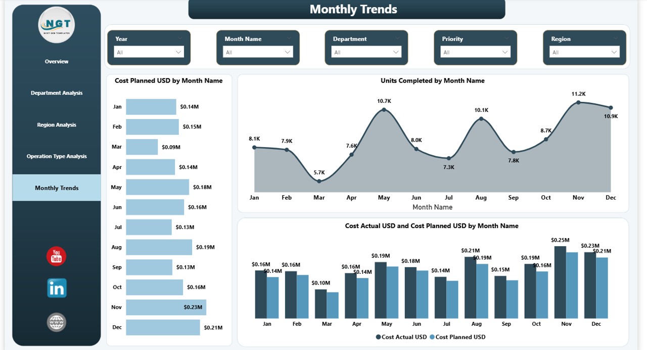
Nine depots send nine spreadsheets. Seven arrive by Tuesday lunchtime, one turns up on Wednesday, and the ninth is a reply to last month’s email with a new attachment under the old file name. The operations director then spends part of Tuesday afternoon pasting columns into a master workbook, correcting the depot that reports fuel in litres while the others report it in pounds, and ringing the branch manager whose late-delivery figure looks too good to be true. By Thursday there is a summary. It is already four days old, and nobody is certain whether the Birmingham tab reflects version three or version four.
That routine is common across UK businesses that run depots, branches, clinics, stores or warehouses, and it has usually grown up for sensible reasons. Each site manager built a sheet that suited their site, head office asked for a copy, and the copies kept coming. The approach works until the number of sites gets large enough that collating takes longer than deciding.
Why several spreadsheets rarely add up to one picture
Three things go wrong when site reporting lives in separate workbooks, and none of them is anyone’s fault.
The first is format drift. Two depots label the same column differently, one clinic records appointment slots in half hours while another records them in minutes, and a store that changed managers in March now files a template nobody else uses. Every difference has to be reconciled by hand before the numbers can be compared, and again the following week.
The second is lag. Once nine files have been collected, checked and merged, the week they describe is over. A problem that showed up at one site on a Tuesday gets discussed the following Thursday.
The third is version confusion. A merged workbook goes out by email, someone corrects a figure, someone else forwards the uncorrected copy, and two directors arrive at the same meeting holding different totals. The argument about which number is right then eats the time meant for deciding what to do.
The Department for Science, Innovation and Technology’s UK Business Data Survey 2026 found that 86% of UK businesses now hold digitised data, while a quarter analyse it for insight. For a multi-site operator, much of the distance between those two figures is collation time: the data exists at every site, and the effort goes into gathering it rather than reading it.
What a single model changes
Power BI, Microsoft’s reporting tool, is often introduced as a way of drawing better charts. The more useful change happens underneath the charts, in what Power BI calls the data model.
A data model is one agreed structure for the business’s numbers. There is a list of sites, a calendar, and a set of tables holding the daily or weekly figures each site produces. Every site’s data lands in the same columns with the same names, so a delivery is a delivery and an appointment is an appointment whether it happened in Leeds or Exeter. Power Query, the part of Power BI that fetches and tidies data, translates each site’s existing export into that common shape, and once set up it repeats the job on every refresh without anyone opening a file.
On top of that structure sit measures. A measure is a saved calculation with a single definition, written in Power BI’s formula language, Data Analysis Expressions (DAX). Define on-time delivery once, as deliveries completed inside the promised window divided by deliveries attempted, and it is calculated identically for every site, every week and every manager who looks at it. The argument about whose percentage is correct ends because there is only one percentage.
Row-level security, which restricts what each person can see according to who they are, means a branch manager opens the same report as the director and sees only their branch.
The questions a Monday morning should answer
A practical test for any multi-site report: list the questions the operations lead wants answered first thing on a Monday, then check whether it answers them without a phone call.
Which sites missed their weekly target, and by how much? Is the miss at one site or across the board? Which site has drifted downward for four consecutive weeks even though no single week looked alarming? Where did overtime or agency hours climb faster than volume? Which location saw complaints rise, and did that coincide with a staffing change? And the question asked most and answered least: what is different about this week compared with the same week last year?
Each of those is a measure applied to the shared model and filtered by site and date. Power BI’s time intelligence functions handle comparisons such as same period last year or a rolling four-week average, which would otherwise take a sheet of nested formulas.
Oracle’s 2023 Decision Dilemma study, which surveyed more than 14,000 people across 17 countries, found that 70% had abandoned a decision because the volume of data was overwhelming, and 35% did not know which sources to trust. A single model settles the trust question by giving every number one source. Layout handles the volume question, by putting the Monday questions on the first page and everything else behind it, and Red Eagle Tech has published a guide to designing dashboards people will actually read on that side of the job.
Why the manager often builds it
This is often assumed to be a job for IT or an external analyst, and sometimes it is. In many operations teams, though, the person best placed to build the first version is the operations manager.
The definitions are the hard part, and the operations lead already holds them. What counts as a late delivery, which clinics should be compared with which, how to treat a site that closed for refurbishment for two weeks: these are operational judgements. Passing them to someone outside the function means a requirements document, a queue, several rounds of correction, and a report that answers last quarter’s questions. A manager who can build and adjust the model asks the question and changes the measure the same afternoon.
The skill is also more learnable than its reputation suggests. A 2022 BARC and Eckerson Group study of 214 companies put active use of business intelligence tools at about a quarter of employees, and named lack of proper training as the biggest single barrier, cited by half of respondents.
The realistic route for a busy manager is a short, intensive course rather than months of tutorial videos. One option is a live two-day course run by Red Eagle Tech, a North London Microsoft Partner that Clutch named a Top Power BI and Data Solutions Company in London for 2026. It runs online over Microsoft Teams, so a manager in Glasgow or Plymouth can attend, costs £600 plus VAT, and is taught in small groups by a trainer who has led Power BI training across a FTSE 100 company. Its seven modules cover getting started, Power BI Desktop, extracting and transforming data with Power Query, building DAX data models and measures, time intelligence and hierarchies, interactive report design including row-level security, and deploying the finished solution to Microsoft 365. That is the set of skills the multi-site model described above needs. The company has trained more than 200 people, and one published review on the course page comes from an operations director responsible for data across several sites who built a first dashboard straight after the two days.
A first week’s worth of work
Nobody needs to model the whole business at once. Start narrow: one measure that every site already reports, three months of each site’s existing spreadsheets dropped into a single shared folder, and a calendar table so that weeks line up. For a delivery business that is probably on-time percentage by depot by week. For a clinic group it might be appointment utilisation. Build that, get the figure to match the current manual version for one week, and the trust question is settled.
The second week adds a second measure, and by the fourth or fifth the nine-spreadsheet Thursday has turned into a report that refreshes itself before the Monday meeting. The depot that reports fuel in litres can carry on doing so. The conversion now lives in one line of Power Query that nobody has to remember.
Running several sites from one screen: Power BI for operations managers
Nine depots send nine spreadsheets. Seven arrive by Tuesday lunchtime, one turns up on Wednesday, and the ninth is a reply to last month’s email with a new attachment under the old file name. The operations director then spends part of Tuesday afternoon pasting columns into a master workbook, correcting the depot that reports fuel in litres while the others report it in pounds, and ringing the branch manager whose late-delivery figure looks too good to be true. By Thursday there is a summary. It is already four days old, and nobody is certain whether the Birmingham tab reflects version three or version four.
That routine is common across UK businesses that run depots, branches, clinics, stores or warehouses, and it has usually grown up for sensible reasons. Each site manager built a sheet that suited their site, head office asked for a copy, and the copies kept coming. The approach works until the number of sites gets large enough that collating takes longer than deciding.
Why several spreadsheets rarely add up to one picture
Three things go wrong when site reporting lives in separate workbooks, and none of them is anyone’s fault.
The first is format drift. Two depots label the same column differently, one clinic records appointment slots in half hours while another records them in minutes, and a store that changed managers in March now files a template nobody else uses. Every difference has to be reconciled by hand before the numbers can be compared, and again the following week.
The second is lag. Once nine files have been collected, checked and merged, the week they describe is over. A problem that showed up at one site on a Tuesday gets discussed the following Thursday.
The third is version confusion. A merged workbook goes out by email, someone corrects a figure, someone else forwards the uncorrected copy, and two directors arrive at the same meeting holding different totals. The argument about which number is right then eats the time meant for deciding what to do.
The Department for Science, Innovation and Technology’s UK Business Data Survey 2026 found that 86% of UK businesses now hold digitised data, while a quarter analyse it for insight. For a multi-site operator, much of the distance between those two figures is collation time: the data exists at every site, and the effort goes into gathering it rather than reading it.
What a single model changes
Power BI, Microsoft’s reporting tool, is often introduced as a way of drawing better charts. The more useful change happens underneath the charts, in what Power BI calls the data model.
A data model is one agreed structure for the business’s numbers. There is a list of sites, a calendar, and a set of tables holding the daily or weekly figures each site produces. Every site’s data lands in the same columns with the same names, so a delivery is a delivery and an appointment is an appointment whether it happened in Leeds or Exeter. Power Query, the part of Power BI that fetches and tidies data, translates each site’s existing export into that common shape, and once set up it repeats the job on every refresh without anyone opening a file.
On top of that structure sit measures. A measure is a saved calculation with a single definition, written in Power BI’s formula language, Data Analysis Expressions (DAX). Define on-time delivery once, as deliveries completed inside the promised window divided by deliveries attempted, and it is calculated identically for every site, every week and every manager who looks at it. The argument about whose percentage is correct ends because there is only one percentage.
Row-level security, which restricts what each person can see according to who they are, means a branch manager opens the same report as the director and sees only their branch.
The questions a Monday morning should answer
A practical test for any multi-site report: list the questions the operations lead wants answered first thing on a Monday, then check whether it answers them without a phone call.
Which sites missed their weekly target, and by how much? Is the miss at one site or across the board? Which site has drifted downward for four consecutive weeks even though no single week looked alarming? Where did overtime or agency hours climb faster than volume? Which location saw complaints rise, and did that coincide with a staffing change? And the question asked most and answered least: what is different about this week compared with the same week last year?
Each of those is a measure applied to the shared model and filtered by site and date. Power BI’s time intelligence functions handle comparisons such as same period last year or a rolling four-week average, which would otherwise take a sheet of nested formulas.
Oracle’s 2023 Decision Dilemma study, which surveyed more than 14,000 people across 17 countries, found that 70% had abandoned a decision because the volume of data was overwhelming, and 35% did not know which sources to trust. A single model settles the trust question by giving every number one source. Layout handles the volume question, by putting the Monday questions on the first page and everything else behind it, and Red Eagle Tech has published a guide to designing dashboards people will actually read on that side of the job.
Why the manager often builds it
This is often assumed to be a job for IT or an external analyst, and sometimes it is. In many operations teams, though, the person best placed to build the first version is the operations manager.
The definitions are the hard part, and the operations lead already holds them. What counts as a late delivery, which clinics should be compared with which, how to treat a site that closed for refurbishment for two weeks: these are operational judgements. Passing them to someone outside the function means a requirements document, a queue, several rounds of correction, and a report that answers last quarter’s questions. A manager who can build and adjust the model asks the question and changes the measure the same afternoon.
The skill is also more learnable than its reputation suggests. A 2022 BARC and Eckerson Group study of 214 companies put active use of business intelligence tools at about a quarter of employees, and named lack of proper training as the biggest single barrier, cited by half of respondents.
The realistic route for a busy manager is a short, intensive course rather than months of tutorial videos. One option is a live two-day course run by Red Eagle Tech, a North London Microsoft Partner that Clutch named a Top Power BI and Data Solutions Company in London for 2026. It runs online over Microsoft Teams, so a manager in Glasgow or Plymouth can attend, costs £600 plus VAT, and is taught in small groups by a trainer who has led Power BI training across a FTSE 100 company. Its seven modules cover getting started, Power BI Desktop, extracting and transforming data with Power Query, building DAX data models and measures, time intelligence and hierarchies, interactive report design including row-level security, and deploying the finished solution to Microsoft 365. That is the set of skills the multi-site model described above needs. The company has trained more than 200 people, and one published review on the course page comes from an operations director responsible for data across several sites who built a first dashboard straight after the two days.
A first week’s worth of work
Nobody needs to model the whole business at once. Start narrow: one measure that every site already reports, three months of each site’s existing spreadsheets dropped into a single shared folder, and a calendar table so that weeks line up. For a delivery business that is probably on-time percentage by depot by week. For a clinic group it might be appointment utilisation. Build that, get the figure to match the current manual version for one week, and the trust question is settled.
The second week adds a second measure, and by the fourth or fifth the nine-spreadsheet Thursday has turned into a report that refreshes itself before the Monday meeting. The depot that reports fuel in litres can carry on doing so. The conversion now lives in one line of Power Query that nobody has to remember.
