A strong visual identity is never built by accident. Every successful brand, app, website, packaging design, or marketing campaign is shaped by a series of intentional design decisions. Colors create emotion, logos create recognition, layout creates structure, and imagery creates mood. But one of the most powerful elements in the entire visual system is often overlooked by non-designers: fonts.
Fonts are not just letters on a screen or printed page. They are visual voices. Before someone reads a single word, the style of the typography already tells them something about the brand. Is it premium or affordable? Friendly or formal? Modern or traditional? Bold or delicate? A font can make a brand feel trustworthy, playful, luxurious, technical, artistic, serious, or youthful within seconds.
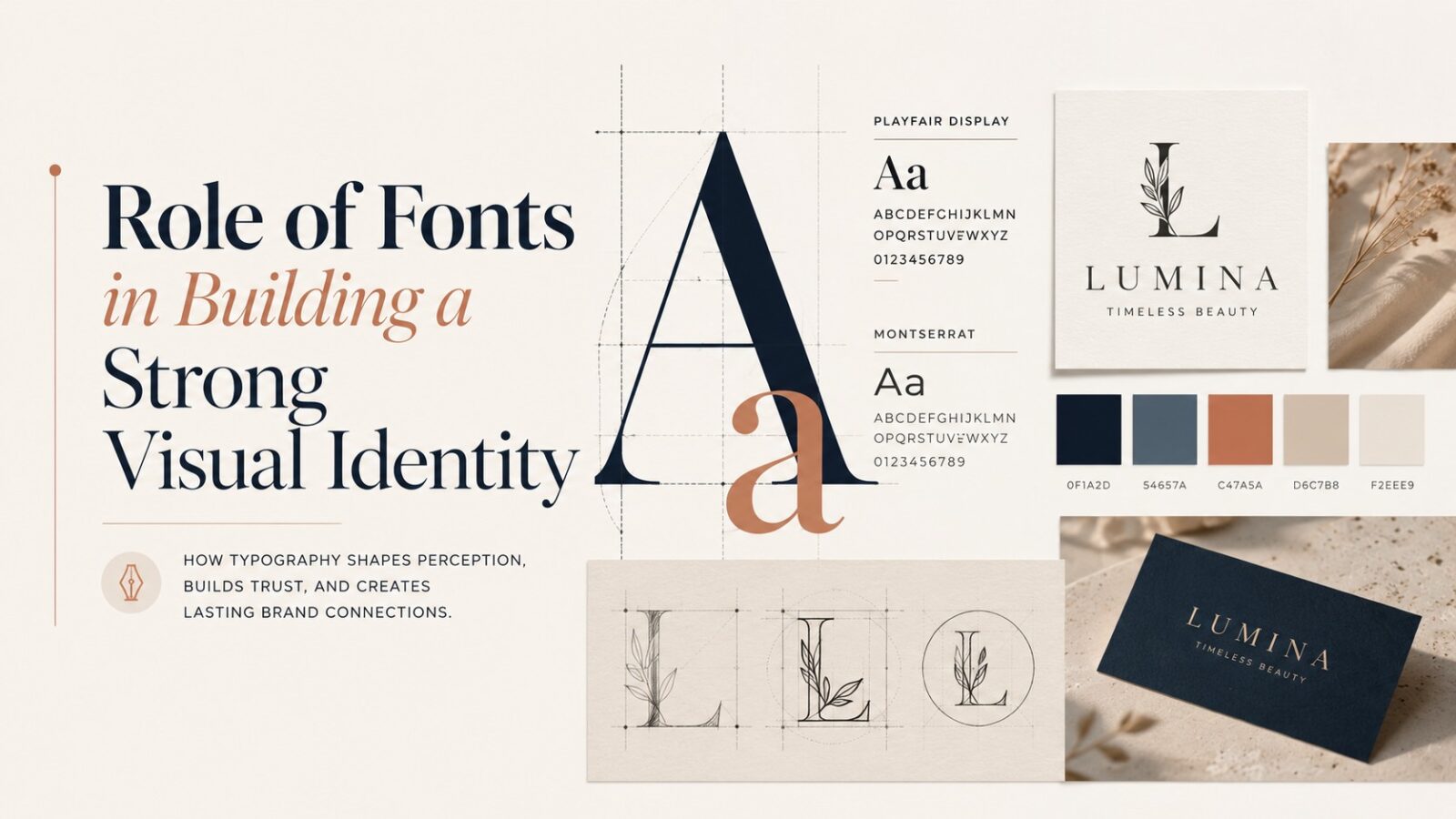
This is why professional designers spend so much time choosing, pairing, testing, and refining typefaces. The right typography can make a brand instantly recognizable and emotionally memorable. For anyone building a website, logo, social media presence, digital product, or complete brand system, exploring a high-quality fonts family can be one of the most important steps in creating a strong and consistent visual identity.
Fonts Are the Voice of a Brand
Every brand speaks, even when it is silent. A logo on a storefront, a heading on a website, a product label, a mobile app button, or an Instagram post all communicate a personality. Fonts play a huge role in shaping that personality.
Think about a luxury fashion brand. It may use elegant serif typography with thin strokes, high contrast, and generous spacing. That style immediately feels premium, classic, and refined. Now imagine a children’s toy brand. It may use rounded, playful, bold letters that feel cheerful and approachable. Both brands are using words, but the visual tone of those words is completely different.
This is the real power of fonts. They help a brand speak in the right tone before the actual message is even understood. A serious financial company using a childish font would feel untrustworthy. A creative design studio using a stiff corporate font might feel boring. A gym using a delicate fashion-style font may not communicate strength or energy. Typography must match the brand’s core personality.
A professional graphic designer does not choose a font simply because it looks beautiful. The question is always deeper: does this font express the right feeling? Does it support the brand story? Does it attract the right audience? Does it feel consistent with the product, service, and promise?
Typography Builds First Impressions
First impressions in design happen extremely fast. When a person lands on a website, sees a business card, opens an app, or views a product package, they form an opinion almost instantly. Typography is one of the first visual elements they process.
A clean, modern font can make a business feel professional and organized. A messy or outdated font can make even a good company look careless. This is especially important in today’s digital world, where people compare brands quickly and judge credibility within moments.
For example, imagine two fitness brands offering the same service. One uses bold, condensed typography with strong spacing and clean hierarchy. The other uses a random decorative font that is hard to read and inconsistent across designs. Even if both gyms have similar equipment and trainers, the first brand will likely feel more professional, confident, and trustworthy.
Typography creates confidence. When fonts are selected properly, users feel that the brand knows what it is doing. When typography feels random, people may not consciously know what is wrong, but they feel that something is off. That small feeling can reduce trust, clicks, purchases, and engagement.
Fonts Create Recognition and Consistency
A strong visual identity depends on consistency. People remember brands because they see the same visual language again and again. The same logo, the same color palette, the same design style, and the same typography all work together to create recognition.
Fonts are a major part of this system. When a brand uses one or two primary typefaces consistently across its website, social posts, packaging, ads, and documents, the audience slowly begins to recognize the brand without needing to see the logo every time.
This is how major brands build visual memory. Their typography becomes part of their identity. The font style, letter spacing, headline weight, and layout rhythm become familiar. Even a simple sentence can feel “on brand” when the typography is consistent.
For smaller brands, this lesson is extremely valuable. Many businesses use one font on their logo, another on their website, another on Instagram posts, and something completely different in brochures or ads. This creates visual confusion. The brand may look active, but it does not look unified.
Good Fonts Improve Brand Personality
Every font has personality. Some fonts feel formal. Some feel casual. Some feel futuristic. Some feel handmade. Some feel editorial. Some feel bold and energetic. This personality becomes attached to the brand using it.
Serif fonts often feel classic, editorial, trustworthy, and sophisticated. They are commonly used by luxury brands, law firms, newspapers, book publishers, and premium lifestyle businesses.
Sans-serif fonts often feel clean, modern, simple, and digital-friendly. They are widely used by tech companies, startups, apps, fitness brands, and modern corporate identities.
Script fonts feel personal, elegant, creative, or emotional. They can work beautifully for wedding brands, beauty businesses, boutique packaging, and handmade products, but they must be used carefully because readability can become a problem.
The key is alignment. A font should not fight against the brand personality. It should amplify it.
Typography Creates Emotional Connection
Design is not only about looking good. It is about making people feel something. Fonts carry emotion through shape, rhythm, weight, and spacing.
A thin serif font with generous white space can feel elegant and calm. A heavy uppercase sans-serif font can feel powerful and direct. A rounded font can feel soft and friendly. A narrow condensed font can feel intense and energetic. A handwritten font can feel personal and human.
These emotional signals influence how people respond to a brand. For example, a wellness brand may want to feel peaceful, natural, and gentle. A harsh, aggressive font would damage that feeling. A sports supplement brand may want to feel strong and high-performance. A soft handwritten font may weaken the message.
The best visual identities use typography to create the right emotional atmosphere. The font becomes part of the experience. It tells people how to feel about the brand.
Font Pairing Strengthens the Identity
Most strong visual identities use more than one font or more than one style from the same type family. Font pairing is the art of combining typefaces in a way that creates contrast without creating conflict.
A common professional approach is to pair a strong headline font with a clean body font. For example, an elegant serif heading can be paired with a simple sans-serif body font. This can create a premium editorial feeling. A bold geometric heading can be paired with a neutral sans-serif body font for a modern tech look.
The key is balance. Fonts should not compete for attention. One should lead, and the other should support. Too many fonts make a brand look chaotic. Usually, two typefaces are enough for a complete identity system.
A safe rule is to choose one font with personality and one font with clarity. The personality font creates memorability. The clarity font keeps the content readable.
Typography Makes Marketing More Memorable
Marketing is crowded. People scroll through hundreds of posts, ads, thumbnails, banners, and emails every day. Strong typography helps a brand stand out.
A powerful headline design can stop the scroll. A consistent font style can make a brand recognizable on Instagram or Facebook. A strong type treatment can make an offer feel more urgent, premium, or exciting.
For example, a gym offer banner with bold, high-contrast typography can feel powerful and action-driven. A beauty brand campaign with soft elegant type can feel luxurious and feminine. A tech product ad with clean geometric typography can feel smart and modern.
Fonts shape the energy of a marketing message. The same words can feel completely different depending on the typeface.
“Limited-Time Offer” in a bold condensed font feels urgent and strong.
“Limited-Time Offer” in a thin luxury serif feels elegant and exclusive.
“Limited-Time Offer” in a playful rounded font feels casual and friendly.
The message is the same, but the emotional effect changes.
Fonts Support Brand Positioning
Brand positioning is about how you want people to see you in the market. Are you affordable or premium? Traditional or innovative? Friendly or authoritative? Local or global? Minimal or expressive?
Typography helps communicate this position.
A premium brand usually avoids cheap-looking fonts and focuses on elegant spacing, refined typefaces, and controlled layouts. A youth-focused brand may use bold, playful, expressive typography. A corporate brand may use clean and neutral typography to communicate stability.
This is why copying another brand’s font style without understanding positioning can be dangerous. A font that works for one brand may completely fail for another.
The best font choice comes from strategy, not personal taste. Designers must understand the audience, market, competitors, price point, and brand promise before choosing typography.
Fonts Help Differentiate a Brand
Many businesses in the same industry look almost identical. Gyms use the same strong colors and bold fonts. Real estate companies use the same corporate layouts. Tech startups use the same clean sans-serif typefaces. Beauty brands use the same elegant scripts.
A thoughtful font system can help a brand stand apart. Differentiation does not always mean using something unusual. Sometimes, it means using typography with more discipline, better spacing, and stronger consistency than competitors.
A unique headline style, custom letter spacing, distinctive font pairing, or custom logo typography can make a brand more memorable. Even small typographic details can become part of the brand identity.
For example, a brand may always use uppercase headings with wide spacing. Another may use bold lowercase headlines. Another may use editorial-style serif headlines with clean minimal layouts. These decisions create a recognizable visual rhythm.
Custom Typography Can Make a Brand Iconic
Some of the strongest brands in the world use custom or modified typography. This does not always mean designing a full custom font. Sometimes it means adjusting a logo typeface, changing letter shapes, refining spacing, or creating a custom wordmark.
Custom typography can make a brand feel more exclusive and ownable. When a brand uses a common font without any modification, it may look good, but it may not feel unique. When the typography is customized, the identity becomes harder to copy.
This is especially important for logos. A logo font should not just be typed out and left unchanged. Professional designers often refine the letters, adjust curves, fix spacing, and create balance so the logo feels intentional.
Even small changes can make a big difference. The goal is to create typography that feels natural, memorable, and aligned with the brand.
Common Font Mistakes That Weaken Visual Identity
Many brands struggle with typography because they make common mistakes. These mistakes may seem small, but they can damage the overall brand image.
One major mistake is using too many fonts. When every design uses different typography, the brand becomes inconsistent and forgettable.
Another mistake is choosing fonts based only on trend. Trendy fonts may look modern today but outdated next year. A strong identity should feel relevant for years, not just for one design season.
Poor readability is another common issue. Some brands use decorative fonts for long paragraphs, making the content difficult to read.
Bad spacing also weakens typography. Even a good font can look unprofessional if letter spacing, line height, and alignment are poorly handled.
Another mistake is ignoring mobile design. Fonts that look elegant on desktop can become too small, too thin, or too crowded on mobile screens.
A professional designer avoids these problems by thinking about function, consistency, and long-term usability.
The Best Typography Feels Invisible and Memorable
Great typography has an interesting balance. It should be memorable enough to build identity, but not so distracting that it fights with the message. In many cases, the best typography feels natural. The viewer may not say, “That is a great font,” but they will feel that the brand looks professional, clear, and trustworthy.
This is the mark of mature design. The font does not scream for attention without purpose. It supports the message, strengthens the identity, and improves the overall experience.
When typography is handled well, everything feels more polished. The logo feels stronger. The website feels easier to use. The marketing feels more consistent. The brand feels more confident.