Have you ever opened a website on your laptop and thought it looked perfect, but when you opened it on your phone, everything looked broken? Maybe the text felt too small, buttons were hard to tap, or the layout looked messy. This is a very common problem in today’s digital world.
The reason behind this issue is simple. Many websites are still built using fixed pixel sizes. Pixels do not adjust well when screen sizes change. So when you move from a big screen to a small one, things stop fitting properly. This creates a bad user experience.
This is where pxless design comes in. Pxless is a smart and modern way of designing websites without depending too much on fixed pixels. It helps layouts adjust smoothly on all devices, whether it is a phone, tablet, or large screen.
In this article, we will explore everything about pxless in a very simple way. You will learn what it means, why it matters, how it works, and how you can start using it easily. Let’s begin step by step.
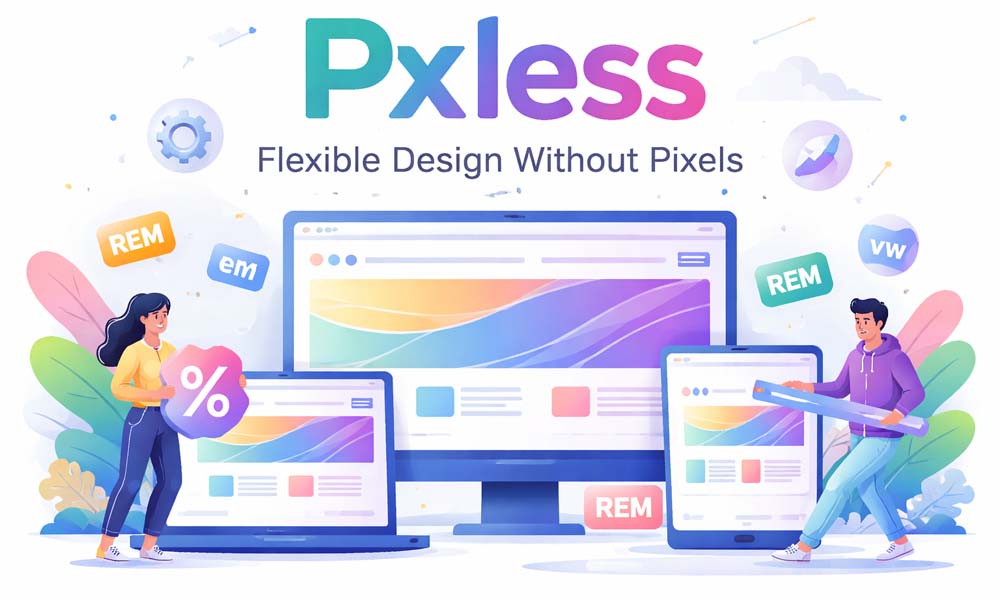
What Is Pxless Design? (Simple Meaning)
Pxless is a simple idea. The word comes from two parts. “px” means pixels, and “less” means using less of them. So, pxless means designing without depending too much on fixed pixel sizes.
In older designs, everything had a fixed size. For example, a button could be 200 pixels wide, and text could be 16 pixels. This worked in the past when screens were similar. But today, screens are very different, and fixed sizes do not work well anymore.
With pxless, we do things in a flexible way. Instead of saying “this must be 200 pixels,” we say “this should take some part of the screen.” This allows the design to grow or shrink based on the device.
Think of it like water in a glass. If you pour water into a small glass, it fits. If you pour it into a big glass, it spreads out. Pxless design works in the same way. It adjusts itself to fit any screen size.
Why Pixels Are Not Working Today
Pixels were useful when most people used desktop computers. Back then, screens had similar sizes. Designers could create one layout, and it would work for almost everyone.
But today, things are very different. People use many devices like phones, tablets, laptops, and even smart TVs. All these screens have different sizes. A design made with fixed pixels cannot adjust to all of them.
For example, a layout that looks perfect on a laptop might overflow on a small phone. Text can become too small to read, and buttons can become hard to tap. This makes users frustrated and they may leave the website.
Another big problem is zoom. Many people zoom in to read better. If the design uses fixed pixels, the layout can break when zoomed. Content may overlap or go outside the screen. This is why pixel-based design is no longer enough today.
Why Pxless Design Is Important Now
Today, people move between devices all the time. You may start reading something on your phone and later continue on your laptop. This means your design must work well everywhere.
This is why pxless design is very important. It helps websites adjust smoothly across all devices. The layout stays clean, text stays readable, and buttons stay easy to use.
Another reason is user comfort. People like to adjust text size and zoom based on their needs. Pxless design respects these choices. It allows content to grow without breaking the layout.
Also, new devices are coming every year. Foldable phones, smart screens, and even AR devices are becoming common. Pxless design helps you prepare for the future because it works on any screen, even ones that do not exist yet.
How Pxless Design Works (Easy Idea)
The idea behind pxless is very simple. Instead of fixing everything with exact numbers, you let the design adjust itself. You create layouts that can grow, shrink, and move based on available space.
For example, instead of saying a box must be 300 pixels wide, you can say it should take 50% of the screen. This way, it becomes smaller on small screens and bigger on large screens automatically.
This makes your design feel smooth and natural. It does not break when screen size changes. It simply adjusts itself like a flexible system that knows how to behave.
Think of it like clothes with stretch fabric. They fit different body sizes comfortably. Pxless design works the same way. It stretches and adjusts to fit different screen sizes without any problem.
Main Rules of Pxless Design
To use pxless design properly, you need to follow some simple rules. These rules help you create layouts that are flexible and easy to manage.
The first rule is to avoid fixed pixels for main layout parts. Instead of using exact numbers, use flexible units. This helps your design adjust naturally on different screens.
The second rule is to focus on content first. Your design should fit the content, not the device. This means text, images, and buttons should decide how the layout behaves.
The third rule is to keep everything fluid. Layouts should not feel tight or stuck. They should have space to grow and shrink. This makes the design look clean and easy to use on all devices.
Units Used in Pxless Design (Very Simple Guide)
In pxless design, we use special units that can change based on the screen or text size. These units help create flexible layouts.
One common unit is rem. It is used for text and spacing. It changes based on the main font size of the page. This makes text easy to scale for different users.
Another unit is em. It works based on the size of its parent element. This helps create designs where elements depend on each other in a flexible way.
We also use percent (%) for width and layout. For example, a box can take 50% of the screen. There are also vw and vh, which depend on screen size. These units make layouts more responsive and smooth.
Flexible Layouts Made Easy (Grid and Flexbox)
Modern tools make pxless design much easier. Two important tools are Flexbox and Grid. These tools help you create layouts that adjust automatically.
Flexbox is great for simple layouts like rows and columns. It allows items to move and adjust based on space. For example, items can wrap to the next line when the screen becomes smaller.
Grid is useful for more complex layouts. It allows you to create rows and columns that can change size easily. You can design sections that look clean on both small and large screens.
With these tools, you do not need to create many different layouts. One flexible layout can work for all devices. This saves time and makes your design more powerful.
Easy Typography and Spacing
Text is one of the most important parts of any design. In pxless, text is not fixed. It is flexible and can grow or shrink based on screen size and user settings.
For example, instead of setting text to 16 pixels, you can use rem units. This allows the text to adjust if the user changes their settings. It keeps the text readable on all devices.
Spacing also matters a lot. The space between elements should grow with the text. If text becomes bigger, spacing should also increase. This keeps the layout clean and easy to read.
There is also a helpful method called clamp(). It allows text to stay within a minimum and maximum size. This keeps everything balanced across different screen sizes.
Pxless vs Pixel Design (Simple Difference)
Pixel design and pxless design are very different in how they work. Pixel design uses fixed sizes. Everything stays the same no matter what screen you use.
This can make the design look perfect on one device, but it often breaks on others. It does not adjust well, and it needs many fixes for different screen sizes.
Pxless design is flexible. It allows everything to adjust based on space. It works smoothly on all devices without needing too many changes.
In simple words, pixel design is rigid, and pxless design is flexible. In today’s world, flexibility is much more important than perfect fixed layouts.
Real Benefits of Pxless Design
One big benefit of pxless design is that it works well on all devices. Whether someone is using a small phone or a big screen, the layout adjusts smoothly. This makes the website look clean and easy to use everywhere.
Another benefit is better user experience. When text is easy to read and buttons are easy to tap, users feel happy. They stay longer on the website and enjoy using it. This is very important in today’s fast digital world.
Pxless also saves time for developers. You do not need to fix layouts again and again for different screens. One flexible design can work for many devices. This makes work easier and faster.
It also helps with SEO and performance. Clean and flexible layouts often load faster. Search engines like fast and mobile-friendly websites. So, pxless design can help your site rank better and reach more people.
Common Mistakes to Avoid
When starting with pxless, some people make small mistakes. One common mistake is mixing fixed pixels with flexible units in the wrong way. This can break the layout instead of improving it.
Another mistake is only changing text but not changing spacing or layout. If text grows but the container stays small, things can overlap. This creates a messy and hard-to-read design.
Some people also forget to test their design. A layout may look good on one screen but not on another. It is always important to check how your design looks on different devices and sizes.
Finally, many people think pxless means no structure. This is not true. Pxless still needs planning. You just use flexible rules instead of fixed numbers. Balance is the key to good design.
How to Start Using Pxless Today
Starting with pxless is easier than you think. You do not need to change everything at once. You can begin with small steps and improve your design slowly.
First, look at your current design. Find places where you used fixed pixels. These can be font sizes, widths, or spacing. Try to replace them with flexible units like rem or percent.
Next, use tools like Flexbox or Grid. These tools help you create layouts that adjust automatically. You do not need many separate designs for different screens anymore.
Finally, test your design on different devices. Use your phone, laptop, or browser tools. See how your layout behaves. Keep improving step by step until it feels smooth and natural.
Future of Pxless Design
The future of pxless design looks very strong. New devices are coming every year. We now have foldable phones, smart screens, and even wearable devices. Designs must be ready for all of them.
Pxless design fits perfectly into this future. It does not depend on fixed sizes. It can adjust to new screen types easily. This makes it a smart choice for long-term design.
We are also seeing more smart tools. AI tools can now help create layouts and spacing. These tools work better with flexible systems like pxless. This makes design faster and smarter.
In the coming years, pxless may become the normal way of designing. Just like responsive design became standard, pxless is now the next step in modern design thinking.
Conclusion
Pxless is not just a new trend. It is a better way to design for today’s world. It helps create layouts that are flexible, easy to use, and ready for any screen size.
When you use pxless, you focus more on people than pixels. You build designs that feel natural and comfortable. This makes a big difference in how users experience your website.
You do not need to be perfect from the start. Just begin with small changes. Replace fixed pixels slowly and test your design. Over time, you will see how powerful pxless can be.
So next time you design something, ask yourself a simple question. Are you designing for pixels, or are you designing for people? If the answer is people, then you are already thinking in a pxless way.
(FAQs)
What does pxless mean in simple words?
Pxless means designing websites without depending too much on fixed pixel sizes. Instead of using exact numbers, it uses flexible units so the design can adjust easily on different screen sizes like phones, tablets, and laptops.
Is pxless design better than pixel design?
Yes, in most modern cases, pxless design is better. Pixel design is fixed and can break on different screens. Pxless design is flexible, so it adjusts automatically and gives a smoother and better user experience on all devices.
Does pxless design completely remove pixels?
No, pxless does not completely remove pixels. Pixels can still be used for small details like borders or lines. But for main layout, spacing, and text, pxless prefers flexible units to keep everything scalable and responsive.
Why do websites break when using fixed pixels?
Websites break because fixed pixels do not change with screen size. When users open the site on smaller screens or zoom in, the layout cannot adjust, which causes text overlap, cut content, or horizontal scrolling issues.
What units are used in pxless design?
Pxless design mainly uses flexible units like rem, em, percentage (%), and viewport units like vw and vh. These units help elements grow or shrink based on screen size or user settings.
Is pxless design good for mobile users?
Yes, pxless design is very good for mobile users. It helps layouts adjust to smaller screens, keeps text readable, and makes buttons easier to tap. This improves the overall experience on smartphones and tablets.
How does pxless design help with accessibility?
Pxless design supports users who zoom in or increase text size. Since the layout is flexible, it adjusts properly without breaking. This makes content easier to read for people with different needs.
Can beginners use pxless design easily?
Yes, beginners can start with pxless design step by step. They can begin by replacing pixel values with simple units like rem or percentage. With practice, it becomes easy and very helpful for modern design.
Does pxless design improve website performance?
In many cases, yes. Pxless design can reduce the need for many layout fixes and extra code. This can make websites lighter, faster, and more efficient, which also helps with better SEO and user experience.
Will pxless design be important in the future?
Yes, pxless design is becoming more important every year. As new devices like foldables and smart screens grow, flexible design is needed. Pxless helps websites stay ready for future changes without redesigning everything again.
You may also read: Cricfooty: Why Fans Are Loving This Powerful Blend of Cricket and Football