
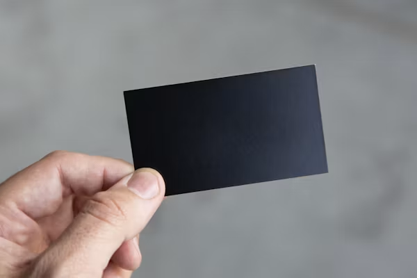
Business cards remain one of the few printed materials that people still handle, keep, and judge in person. In a world where most professional communication happens on screens, a card handed across a table carries weight in a way that a digital contact exchange simply does not. That weight increases considerably when the card is printed on a dark or fully black substrate rather than traditional white stock.
Black business card paper has grown in use across industries where first impressions carry operational significance — legal, financial, creative, and high-end service sectors among them. But the printing process for dark substrates is meaningfully different from standard card printing, and many businesses find out too late that what worked for their white cardstock does not translate cleanly to black. The result is wasted print runs, inconsistent color output, and finished cards that do not represent the brand in the way intended.
This article addresses the technical and practical realities that printers, designers, and business owners rarely discuss upfront — the details that affect the finished product before the cards ever reach someone’s hands.
The Substrate Changes Everything About Your Ink Strategy
When you choose to work with black business card paper, the fundamental assumption of standard print production changes. Most commercial printing is designed around white stock, where ink sits on a reflective base that amplifies color. On a black substrate, there is no reflective base. Ink is competing against absorption, and the card’s dark fiber structure can visually suppress color intensity unless the process is adjusted deliberately.
This means that simply sending a standard CMYK file to a printer and switching the stock color will not produce the result you expect. Colors that appear vivid on a screen or on white paper will look muddy, muted, or nearly invisible on black card stock. The ink strategy must be built from the ground up with the substrate in mind.
Opacity Becomes a Functional Requirement, Not a Design Choice
On white stock, ink opacity is rarely a concern. The stock itself provides a visual floor that makes colors appear solid even with standard ink coverage. On black stock, ink opacity determines whether a printed element is visible at all. Low-opacity inks, which perform adequately on white, will fail to register as distinct colors on a dark surface. This is why many printers working with black substrates shift toward specialty inks — including white-base inks, UV-reactive formulations, or screen printing approaches — rather than relying on standard offset or digital print processes.
The decision around opacity is not a finishing consideration. It must be made at the design and prepress stage, before any production begins. Changing it after a proof is approved often means restarting the process entirely.
White Ink Is Not a Simple Add-On
White ink on black stock is the most common technique for making text and graphic elements legible. But white ink behaves differently from every other color in the print process. It is thicker, slower to dry, more prone to uneven application, and more sensitive to substrate texture than standard inks. Printers who do not regularly work with white ink on dark stock often underestimate these variables, and the results show up clearly in the finished cards.
Uneven white ink application creates visible patchiness in solid white areas, which looks unprofessional on a premium-positioned card. Text printed in white ink can also exhibit edge softness, where the letterforms appear slightly blurred or feathered at their boundaries rather than sharp and defined.
The Printing Method Determines White Ink Performance
Digital printing and offset printing handle white ink very differently. In digital print environments, white ink is often applied in a single pass, which may not provide sufficient opacity for solid coverage on a deeply pigmented black substrate. Offset printing allows for more controlled layering, but requires setup time and minimum run quantities that may not suit smaller card orders. Screen printing, while less commonly used for business cards, can achieve strong white ink coverage but introduces its own limitations around fine detail and registration accuracy.
Understanding which method your printer uses for white ink — and what its limitations are in terms of coverage, drying, and detail resolution — is a necessary conversation before production begins, not after the first proof arrives.
File Preparation for Dark Stock Requires a Different Workflow
Standard design files built for white stock do not transfer cleanly to dark substrate print jobs. The most common issue is background handling: designers working in programs like Adobe Illustrator or InDesign build files with white backgrounds as their default, and removing or inverting that background for black stock production introduces alignment and bleed problems that require correction at the file level.
Additionally, any design element that relies on a white or light fill for legibility must be explicitly set to print as an ink color on dark stock. Elements that appear white because of the white background in a design file will simply disappear on black card stock if they are not converted to actual white ink fills in the print-ready file.
Bleed, Trapping, and Edge Definition Shift in Importance
Bleed and trapping are standard concepts in print production, but they take on greater operational significance when working with dark substrates. Because black card stock is itself the visual base of the design, any slight misalignment during cutting will expose a different shade or texture at the card’s edge — which is more visually apparent on dark stock than on white. Trapping settings that prevent ink from pulling away from edges at the cut line must be calibrated carefully, and bleed areas must be sufficient to absorb minor variance in the cutting process.
These are not errors that can be corrected after production. They must be built into the file before the job goes to press.
Foil and Specialty Finishes Behave Differently on Black Card Stock
Foil stamping is one of the most common specialty finishes applied to black business cards. The contrast between a metallic gold or silver foil and a deep black substrate is visually striking, and it is one of the reasons dark stock has gained traction in premium and professional markets. However, foil adhesion on dark stock depends heavily on the card’s surface coating and texture, and not all black card papers accept foil equally well.
Uncoated black stock provides a porous surface that absorbs pressure differently than coated stock, which can affect how cleanly the foil transfers. Textured black papers introduce an additional variable, as foil applied to a textured surface will follow the texture rather than lying flat, creating a result that may or may not align with what was intended.
Raised and Debossed Elements Interact With the Card’s Structural Weight
Embossing and debossing — techniques that press the card surface to create raised or recessed elements — are well-suited to black card stock from a visual standpoint, since the shadows and highlights created by these techniques are easy to see against a dark background. However, the structural weight and thickness of the black stock being used directly affects how cleanly these impressions hold. Thinner black card stock is more prone to cracking or creasing during embossing, while heavier stock requires more die pressure and a more experienced operator to achieve clean results.
Color Theory Works in Reverse on Black Substrates
Designers and brand managers who are accustomed to working with standard print color systems often find that their mental model of how colors interact needs adjustment when working with black stock. On white paper, adding color means adding pigment to a neutral surface. On black paper, creating visible color means placing ink that must overcome the absorption of the dark substrate beneath it, which shifts how colors appear in relation to each other and in relation to the background.
According to the principles of color theory, color perception is significantly affected by surrounding values and contrast relationships. On a black background, cool colors tend to recede even further while warm colors can appear more saturated than expected — particularly when printed with high-opacity inks.
Proofing for Black Stock Is Not Optional
Many businesses skip physical proofing for standard card jobs because digital proofs on screen are reasonably accurate for white stock production. This logic does not hold for dark substrate printing. Screen proofs display color on a backlit white display, which is visually opposite to a dark printed card held under ambient light. The gap between what a screen proof shows and what a printed card on black stock actually looks like is large enough to produce entirely different results.
Physical proofing on the actual black card paper stock — not a similar paper, not an approximation — is the only reliable way to confirm that a design will print as intended before committing to a full production run.
Not All Black Card Papers Are the Same Material
The term “black business card paper” describes a category of substrate, not a single product. Within that category there is significant variation in how the paper was made black — whether through surface coating, through-dyeing, or full saturation — and that variation directly affects how each type accepts ink, foil, and finishing treatments.
A surface-coated black card will behave differently under UV coating than a through-dyed card. An uncoated, naturally black stock will absorb ink differently than a black-coated bright white card base. These distinctions matter when selecting materials for a specific print method, and the right paper choice depends on the entire production chain, not just the visual appearance of the stock.
Cutting and Finishing Require Adjusted Equipment Settings
Black card stock, particularly heavily coated or dense versions, places more demand on cutting equipment than standard white cardstock. Blades dull more quickly, and cut quality degrades faster across a production run. For smaller print shops that do not regularly run dark stock, this can result in cards with slightly ragged or compressed edges by the end of a batch — a quality issue that is difficult to detect until the cards are in hand.
Specialty finishing options like rounded corners, die-cutting, or edge painting introduce further variables on black stock. Edge painting, in particular — where the card’s edge is coated in a contrasting color — requires that the cut be clean and consistent, since any irregularity in the cut edge will show through the paint application.
Storage and Handling Affect Dark Stock More Than White
Black card stock shows handling marks, fingerprints, and surface abrasion more readily than white stock. This is a practical reality that affects both storage before production and handling after the cards are printed. Uncoated black card is especially susceptible to visible scuffing, and even a protective matte or gloss coating can be scratched under normal handling conditions, leaving lighter marks against the dark background.
For businesses ordering black business cards in volume, packaging and storage conditions between production and distribution matter more than they would for standard stock. Cards stored loosely in a drawer or bag will show wear much faster than the same cards stored flat in a protective sleeve or box.
The Supplier Relationship Determines Consistency Across Runs
Consistency across print runs is one of the most underappreciated operational challenges in business card production on dark substrates. Because there are more variables to control — ink opacity, white ink application, foil adhesion, cut quality — the margin for run-to-run variation is wider than with standard white stock printing. A business that reorders black cards expecting them to match the first batch precisely will often find small but visible differences in color, finish, or edge quality.
The most reliable way to manage this is through a consistent supplier relationship, where the same printer, the same paper stock, and the same production settings are used each time. Switching suppliers between orders resets all of those variables and introduces new risk of inconsistency.
Conclusion
Printing on black business card paper involves a set of technical and operational considerations that simply do not apply to standard white stock production. The substrate changes how ink behaves, how files must be prepared, how proofing must be conducted, and how the finished cards should be stored and handled. Each of these factors compounds the others, which is why problems with dark substrate print jobs tend to appear late in the process — often after production has already begun.
The businesses and print professionals who get consistently good results from black card stock printing are not working harder. They are working with a clearer understanding of what the material requires from the start. That understanding begins at the material selection stage and runs through every decision that follows — from file preparation to supplier selection to final delivery. Treating black card printing as a variation on standard card printing is the most common source of preventable production problems in this category. Treating it as its own distinct process is what makes the difference.